Please note:
Due to the sensitive nature of information and NDA clauses, client identities have been anonymised in my case studies.
Case Study shortened on mobile
Migrating a Product Site Back to the Core Domain
About the project
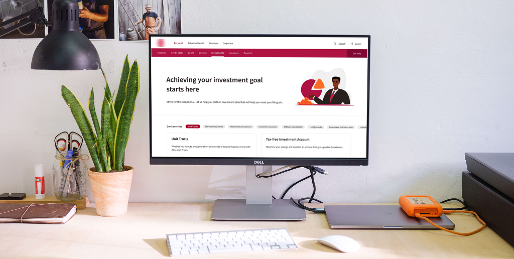
A banking product was originally hosted on a standalone sub-domain in hopes that a focused, isolated experience would increase client conversions. However, data revealed significantly lower traffic and engagement than expected. The decision was made to migrate the product back into the bank’s main site (CoZa) to improve visibility, unify user experience, and leverage SEO benefits.
A banking product was initially hosted on a standalone sub-domain in hopes of driving higher conversion. However, data revealed significantly lower foot traffic and engagement compared to the main site. The goal was to migrate the content back to the bank’s primary domain (CoZa), improving discoverability and SEO performance.
My role
As the Product Designer, I was responsible for the end-to-end UX and UI process. This included conducting research, auditing content, redesigning the IA, testing navigation usability, and creating high-fidelity prototypes using the bank’s design system. I collaborated closely with stakeholders, SEO analysts, and developers to ensure the migration was seamless.
Product Designer — UX Research and UI Design
Process Overview
To execute a migration like this, it was important to balance both technical constraints and user needs. I broke the process into several key phases that informed the overall strategy:
Heuristic Evaluation
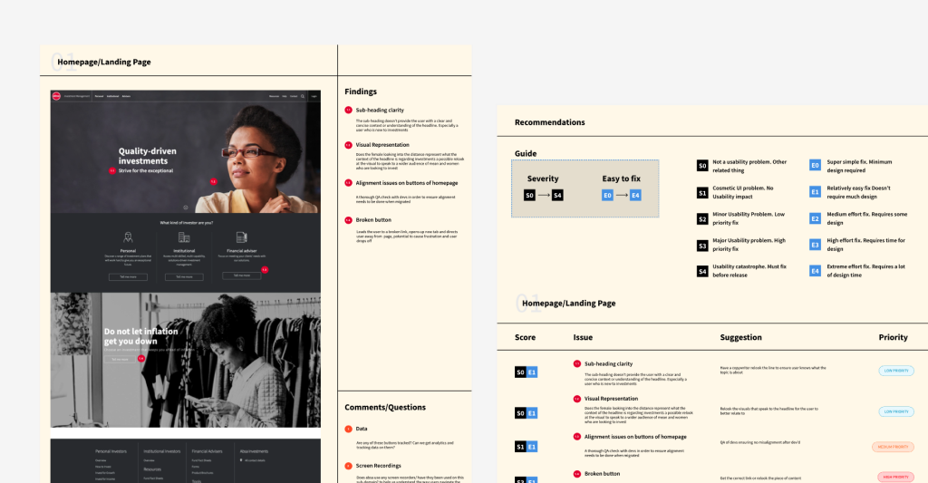
I began by performing a heuristic analysis on the sub-domain. This involved reviewing each page using usability principles like consistency, visibility of system status, and match between system and real-world language. This helped uncover usability issues such as confusing navigation, inconsistent UI patterns, and redundant content.
Conducted a usability audit of the sub-domain to identify pain points and navigation inefficiencies.
Content & Sitemap Audit
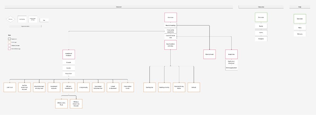
Sitemap Analysis
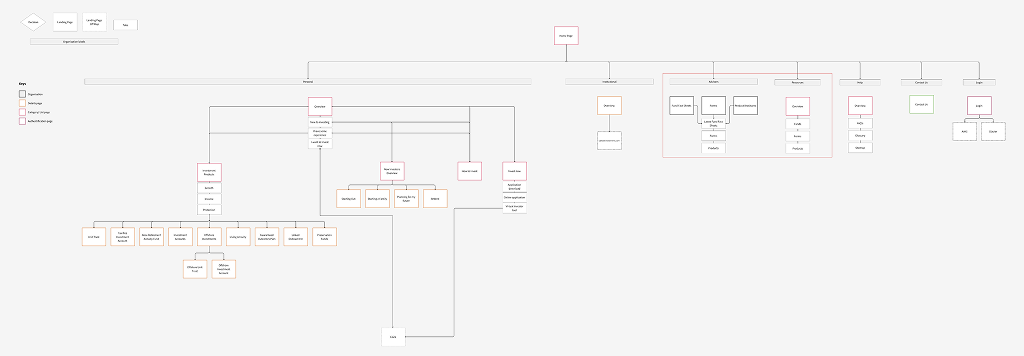
I mapped the entire information architecture of the sub-domain to understand how deep the content structure was and whether it created unnecessary complexity for users. This visual map became crucial for identifying problematic navigation paths and locating pages with high bounce rates or low engagement.
Mapped the existing IA to assess depth, consistency, and navigation flow
Stakeholder Collaboration
User Behaviour & Content Audit
I worked alongside stakeholders and content owners to assess which pages were outdated or redundant. We made informed decisions on which content to retire or simplify. I also collaborated with the Design Director to benchmark against other banking product journeys—distinguishing between “nurture” journeys (educational) versus “direct” conversion paths.
Analysed bounce rates and outdated content. Collaborated with stakeholders to evaluate which content could be removed or simplified.
Benchmarking
Met with the Design Director to compare similar products and determine if a nurture or direct sales approach was appropriate.
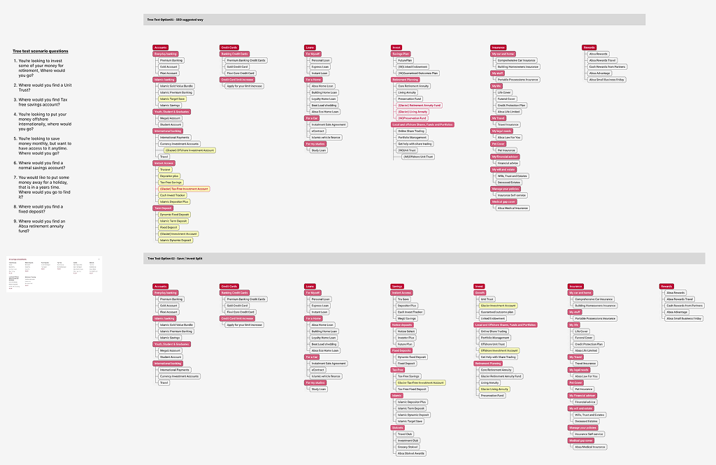
IA Redesign – ‘To Be’ Sitemap:
IA Redesign
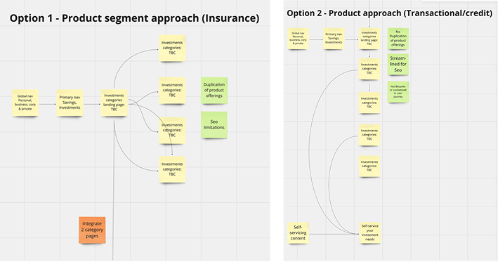
With our audit and stakeholder feedback complete, I designed a simplified, minimal sitemap focused on high-performing, relevant content only. This meant removing noise and streamlining the user journey to key tasks or information.
Proposed a streamlined “To Be” sitemap, applying a minimalist, content-light strategy.
SEO & Navigation Strategy
Navigation Integration
One of the biggest challenges was figuring out where this product should live within the CoZa site’s complex navigation. I engaged the SEO team to analyse search keyword data and site navigation performance. We then validated hypotheses using Tree Testing via Maze to ensure users could locate the product through both top-down browsing and search.
Partnered with the SEO team to analyse keyword data and ran Tree Tests in Maze to evaluate proposed navigation structures.
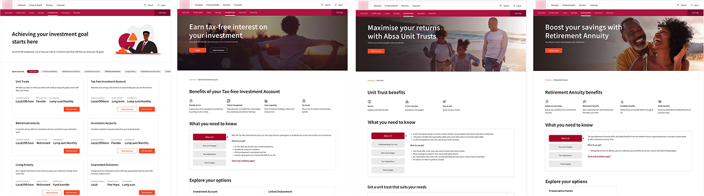
UI Design & Iteration:
UI & Design System
Leveraging the bank’s mature design system, I created high-fidelity screens that aligned with the visual identity of CoZa while improving the content hierarchy. I focused on accessibility, layout responsiveness, and visual clarity. Several iterations were made in response to stakeholder feedback before final sign-off.
Used the bank’s mature design system to build high-fidelity mockups with a strong content hierarchy, iterating with stakeholders.
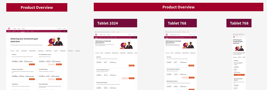
Developer Handoff
Once designs were approved, I broke each page into detailed responsive specs across breakpoints for desktop, tablet, and mobile. This made the build process efficient and reduced back-and-forth during implementation.
Final designs were broken down by breakpoint for development.
Outcome
The redesigned experience went live on CoZa, successfully retiring the sub-domain. The new layout was leaner, more intuitive, and better aligned with how users searched for and explored banking products. SEO performance improved and internal stakeholders reported easier content governance moving forward.
The redesigned site was successfully launched on the main CoZa platform, offering a simplified user experience and improved performance metrics.
Key Takeaways
- Less can be more: Removing content that doesn’t serve a purpose can drastically improve navigation and reduce user frustration.
- Involve SEO early: Your IA strategy should be data-informed, especially when merging into large ecosystems like a corporate site.
- Tree testing is gold: It’s a lightweight, effective way to validate complex navigation decisions without needing to build prototypes.
Simplification is powerful: Less content led to a clearer, more user-friendly experience.
Data-backed decisions ensured alignment with user and business goals.